
I reached a point in the project where I had used a lot of information but hadn’t created too many actual illustrations. I was advised to create some more sketches and develop some illustrations. I went away and drew out many thumbnails of ideas after reading. I then picked my favourites and went on to further develop them. This was a key part of the process as many times I would decide on a better angle or a better idea that was quite similar to the previous one. After deciding on a sketch I would sketch it out digitally and play around with colour and textures.


Colours


I decided to keep a limited colour palette for these illustrations to make them look related and flow nicely. My colour palette began with the colour pink. I wanted to use pink as it represents femininity, it also represents good health which links nicely with sanitary products and menstruation. I didn’t want to be too obvious and create red images as it wouldn’t be that original. Although Pantone created a colour to raise awareness for period health. I chose a bright pink instead which was inspired by the pinkest pink. A colour that represents femininity but is also a very striking and strong colour. To balance out the pink I wanted some soft blues and the rest I found using the website coolors.co, after many swaps I decided on a colour palette and edited it slightly until I was happy. The colour palette felt very natural to me, however it felt a bit unusual going against the natural colours of some things aka creating a bright pink fork. I did have to simplify the use of colours for some images as I used too many colours and it looked too busy. Swapping around the colours really helped and made the images look less harsh.


I added in texture to the images and some hand created elements such as ink drops. I am really happy with the way the illustrations turned out and how they look collectively.
Illustrations:


I wasn’t sure how to tie the images and the type together, but I knew I wanted to create a ‘final piece’ or just something that brought them together as one. I then had an idea to bring the campaign full circle. I decided to create a tabloid.
The idea behind it:
- Many girls are having to use newspaper instead of menstrual products, the paper in their hands brings the realisation to life
- It can help reach an older demographic, as not everyone is on instagram or online. This helps spread the message further and educate more people
- It can give my work an editorial context, which is an area of Illustration I am keen to work in, in the future
I created a double page spread from what I remembered from Typography 101. I also created a really quick mini layout to see what went on each page. Looking back on Typography 101 notes helped a lot creating this double page spread.


I then mocked it up digitally to see how the colours and images worked together. After I was happy with it I then began the real spread on Indesign, ensuring the measurements were accurate.
Here is the spread :


I used https://www.the-news-hound.com/tabloid-printing to print my work as I needed a fast turn around. Because I was running out of time I also created a few mockups incase the tabloid didn’t arrive on time :

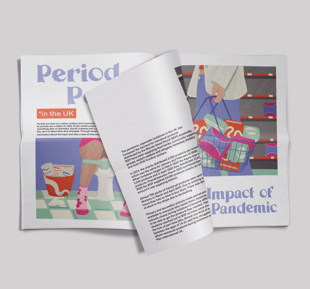
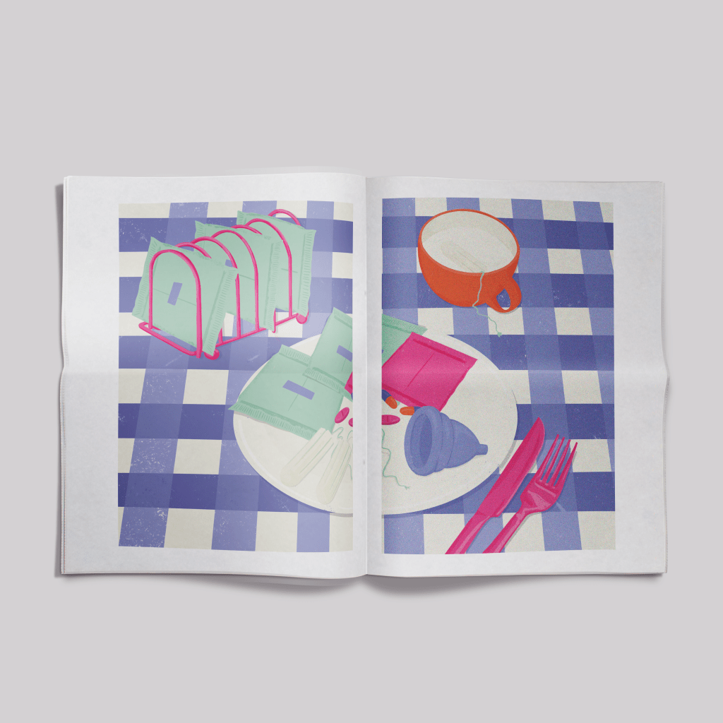
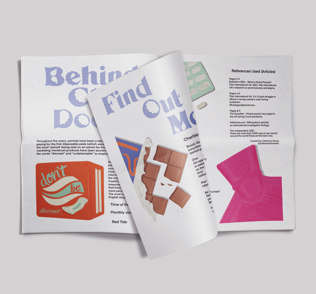
Here are the images of the real tabloid :


I used inspiration from others on the course who had found creative ways to take photos and display their work.
I really enjoy seeing my work printed as it’s satisfying seeing it off the screen and in your hands. The tabloid turned out better than I had hoped and I think I managed to convey the important issues across.
 Catherine's learning journal