
Introducing my typeface
A typeface is a particular set of glyphs or sorts (an alphabet and its corresponding accessories such as numerals and punctuation) that share a common design.


The typeface I designed is subtly based on my current project about Period Poverty. I desired to create a fun and playful type that also gave a nod to a stronger message. I wanted to make the reference to period subtle as I want the type to be usable for many projects and by many people. The name also hints towards periods without overdoing it and reducing the appeal. Using key elements such as the waves and the droplet placed in a few of the letters, it allows the type to be used for other projects referencing water or simply for any use that calls for a playful type. I designed the type in colour rather than black and white and I really think it looks best in a light colour and as a big font size (as the details really stand out)
Selling
I am aiming to sell my typeface soon after I tweek it to be as perfect as I can get it. I plan to use a platform such as MyFonts to begin with, or just on my shop page where I plan to sell my prints. Later down the line I am hoping to be able to sell on Creative Market as I enjoy getting inspiration and purchasing from their retailers and I believe they market your work well. Creative Market only takes on retailers who request an invite and have already been selling their products, so that will be my first step once my type is complete.
I also plan on creating more accents and symbols. I created the accents commonly used in Welsh. The Welsh language uses many accents such as circumflex, umlaut, acute accents. Sometimes it can be a pain to find a typeface with these included. I plan on developing the range of accents to make ‘Flow’ more accessible to most languages.
In work – demonstration
Here is ‘Flow’ in use within my own work and the type


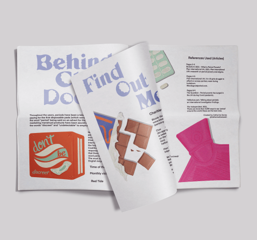

I am really happy with how it turned out in the end, as I didn’t expect it to look as polished as it does. Admittedly it needs tweaking, however I am really happy with the shape of the letters and how it looks in use. Studying Typography 101 for Field in second year increased my interest in typography. I am very keen to learn more and so, I will definitely be looking further into typography and creating more typefaces in the near future.
 Catherine's learning journal